Prime Virtual Media
Kingston, Ontario November, 2025 BRAND RELIQUARYI love when a logo clicks into place like a puzzle piece.
Prime Virtual Media came to me with three challenges:
1. Their name: “Prime.” You recognize it everywhere.
2. The logo: The CEO DIY’d it on Canva.
3. The industry: Oversaturated and hyper-competitive. Especially in Kingston, Ontario.
PVM wanted to be thought-of as the premium real-estate media provider in the city, and the obvious choice for agents. But their current branding was working against them by lowering their perceived value.
Here are a few ways Visual Identity Design solved that:
Logo Before (Not my work)

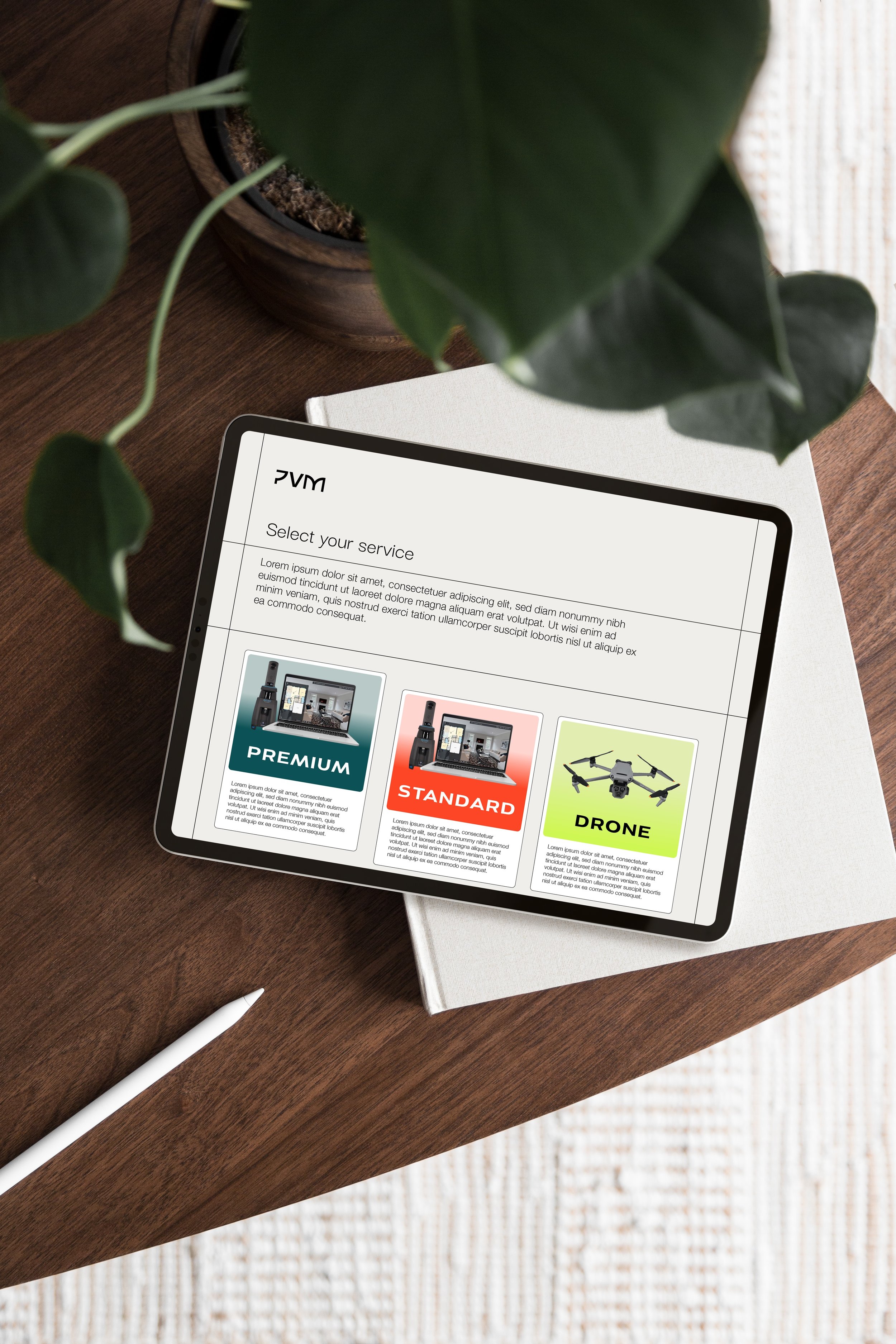
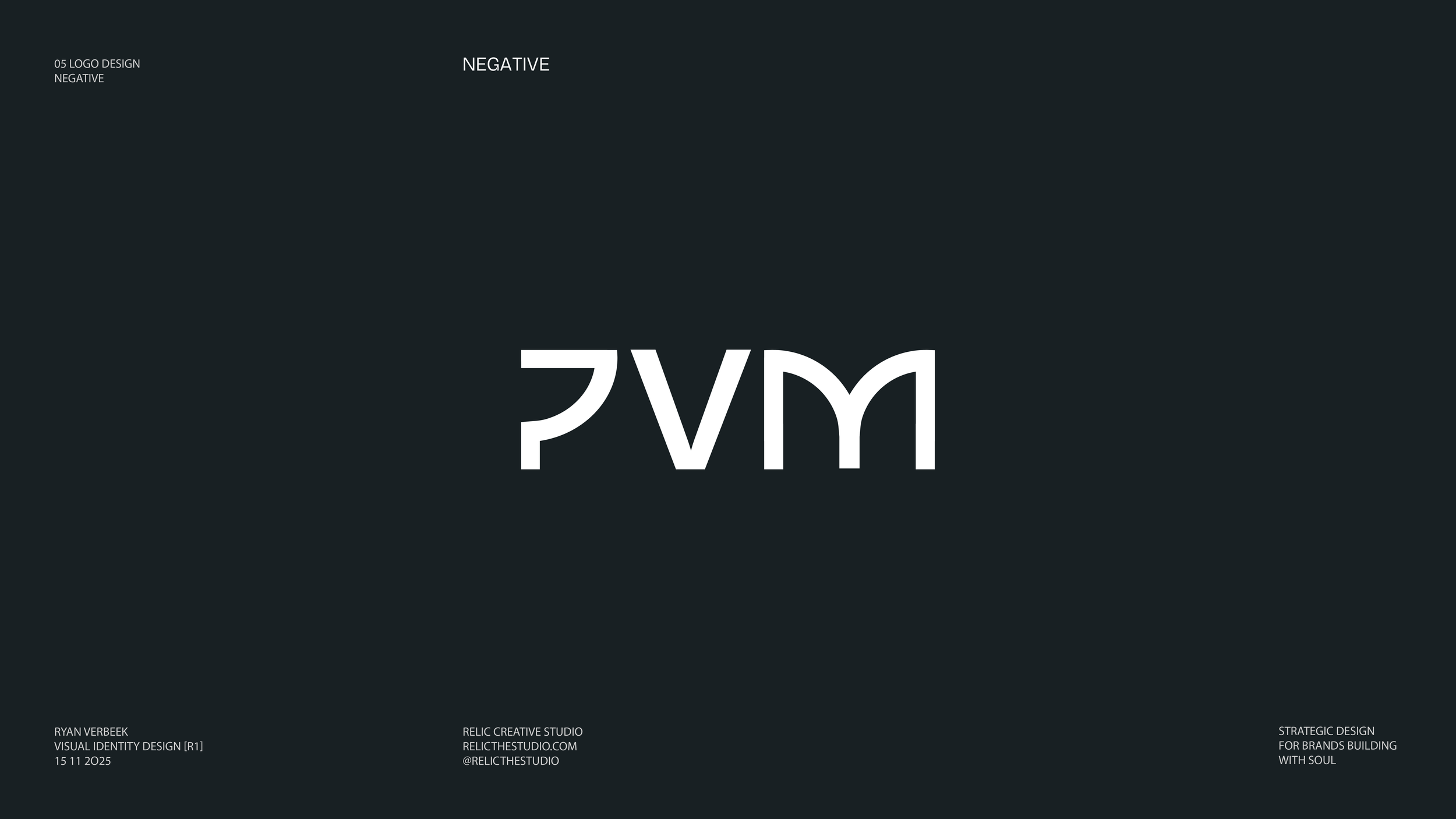
PRIMARY LOGO AFTER (BY RELIC)1. Abbreviating the name in the primary logo → instant clarity & distinction
Even though their “Prime” industry doesn’t overlap with other well-known Primes (big-box online retailer, influencer energy drink, etc.), the abbreviation creates zero confusion and stronger identifiability.
2. Removing the “what we do” from the logo
New businesses describe their services in their mark. PVM doesn’t need to.
Instead, I designed a custom wordmark that references the brand's floor-plan service. A nod to their core service and a detail agents will sense even if they don’t consciously notice it.
It creates some curiosity, expresses confidence, and is instantly memorable.

3. A strategically masculine tilt
Real estate agents in Ontario are split 54% male / 46% female.
Marketing psychology shows that women are more likely to hire a masculine-leaning brand, while men are less likely to hire a feminine one.
So leaning masculine widened their appeal without alienating anyone. (It also happened to be what the client requested!)
Together, these decisions elevated Prime Virtual Media from seeming “DIY’d and new to this” to distinct, premium, and trustworthy in a crowded market.